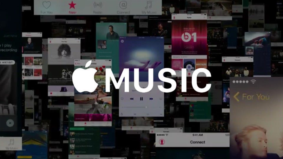
Apple’s WWDC 2016 developer event in San Francisco is the company’s software-focused conference, and even Apple Music has joined in the fun. Earlier today, Apple introduced changes to its streaming music app for iOS and Android.
For 2016, Apple’s senior vice president of software Eddy Cue announced a visually revamped Apple Music, which is designed to be much easier to use.
You’ll be able to navigate with a more streamlined interface, with cards for more intuitive tapping around Recently Added, Downloaded, and other categories. Lyrics will also appear below each song, for those of you who sing along with your tunes while you listen. The app will continue offering curated mixes alongside the rest of last year’s updates, and has seemingly diminished the social network component.
All this comes as competitor Spotify continues to reign as leader in mobile music streaming with 30 million paid subscribers.
Meanwhile, just this past Friday Amazon announced its plans to enter the paid music streaming market as well, and could compete with Apple Music for listeners.
Apple Music already has amassed 15 million paid subscribers, while this year marks its one year anniversary. The redesign comes amid complaints that the service is confusing.
Bloomberg was among the first to report the redesign back in May, which is funny, because the two look strangely similar.
We’ll see soon whether this new interface helps Apple Music poach subscribers from Spotify or stay ahead of Amazon.
Follow all of our WWDC 2016 coverage here.


1 Comment
Thank you for shedding light on this subject, especially in the tech sphere.