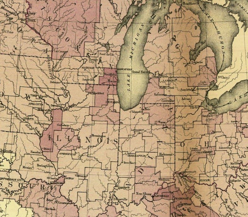
This 1875 map of the prevalence of syphilis in the Union draws from one of the U.S. government’s earliest sources of big data: Civil War conscription records.
In the age before antibiotics, syphilis rendered an individual unfit for military service. Conscripted men who showed syphilitic symptoms were rejected from the army and exempted from the draft. This map, then, plots out the prevalence of syphilis in a region; it shows how many drafted men per 1,000 expressed signs of syphilis. A time traveler wishing to vist this era would therefore be advised to avoid Racine, Wis.; Quincy, Ill.; both Lousiville and Lexington, Ky.; Auburn, NY; and Washington, DC. Just FYI, time travelers.
Connecting geography with public health was still relatively new at the time. In 1854 in London, physician John Snow plotted deaths from an outbreak of cholera, and was able to trace them all back to a single point: the contaminated water pump on Broad Street. In modern times, public health workers continue to plot big data onto maps, making useful tools for fighting and understanding disease. The HealthMap, created by Boston Children’s Hospital in 2006 and still going strong, plots outbreaks in real time on a navigable world map.


