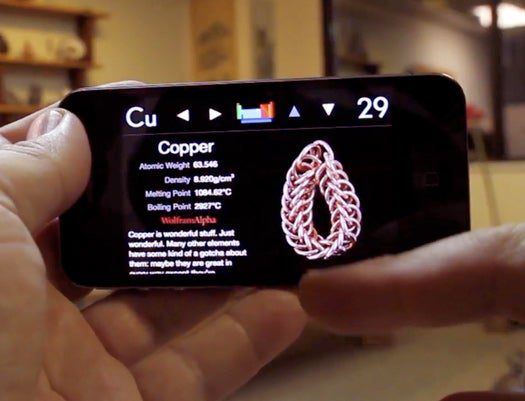
Theodore Gray, the man behind our Gray Matter column and the amazing The Elements: A Visual Exploration periodic table app for the iPad (and in print), has just rolled out a version for the iPhone 4, which packs all the same info and photography into that Retina Display, along with a special trick. Here, Theo gives us the back story on what made this new edition possible.
My book The Elements: A Visual Exploration has been available in paper form since last year, and in electronic form for the iPad since April 3rd, the day the iPad was released. And boy what a ride it’s been! We’ve sold over 70,000 copies in just a couple of months, and come out with versions for five languages: English, French, German, Japanese, and British English. (Yes, British English is totally different than normal English, they even spell three elements differently, which is kind of important if you don’t want kids who buy your ebook in England to get bad grades on their science projects.)
The one thing that’s been missing is a version for the iPhone and iPod Touch. People kept asking about it, and I kept saying, maybe, but it’s painful to imagine squeezing those big beautiful page layouts down to a tiny little thing. We could have done an iPhone version months before we did the iPad version, but it just didn’t seem worth it.
In fact the only reason we did an iPad version was because Apple had kindly invented the exact device I’d been waiting for in order to make an ebook version of The Elements worthwhile. And the iPhone still didn’t seem like a good device for this material.
Fast forward to June 7th, and Steve Jobs did two very nice things for me in his keynote address at a big Apple conference. First, he gave The Elements a great plug during the keynote. And then he announced the exact device I’d been waiting for to make an iPhone version of The Elements seem worthwhile.
The iPhone 4’s screen is exactly the same physical size, but it has four times as many pixels (twice as many in each direction). The iPhone4’s 960 x 640 pixels are almost as many as the iPad’s 1024 x 768, just squeezed down into an extremely small area. So in theory we could have taken the complete page layouts pretty much as they were on the iPad and put them on the iPhone4. And as long as you had a magnifying glass and needles for fingers, you could have used it the same way.
Instead we decided to take mercy on the reader and completely redesign the layout and navigation of the book to fit the physical size of the screen. All the material is still there, just presented one sample at a time instead of with many samples on one page. The one thing I insisted on is that every pixel be perfect: There is no stretching up of low-res graphics. (The price you pay for this is a really big download size, just like the iPad version. Deal with it: If you want art, you do what it takes.)
The iPhone 4 adds one more little twist to bring its awesomeness level up another notch: A gyroscope that lets it sense rotation. The Elements is all about rotating objects. Put two and two together and it was inevitable, we had to add this feature. So now, when you hold the phone and rotate it around, the object on the screen stays still. By which of course I mean that it rotates on the screen in such a way as to appear stationary in physical space: You can literally walk around it, holding the phone in front of you like a window onto the object. The iPad version can’t do that, because the iPad can’t tell you when it’s being rotated.
As you can see above, this is especially fun if you have a swivel chair: I had a number of top Apple executives spinning in their chairs and laughing like kids at the joy of seeing a chunk of scandium spinning with them just because it could. And isn’t that what makes it all worthwhile?


